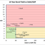
Chart 1 Source: Trading Economics The above chart shows the 10 year bond yield versus the Debt/GDP of the 10 largest countries in the world by GDP (Except Turkey whose bond data is missing). The chart is divided into 3 sections… Red section…countries with high 10 year bond yields Orange section…high debt levels but low …
Daily Archive: July 8, 2012
pub-5731955080761916


