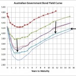
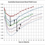
Source: RBA The above chart shows that bond yields shows that after bond yields reached a high around 1 month ago they have declined across all terms by around 50bps. That means that most of the traditional bond funds would have produced capital gains of around 2% over that last month (because the duration od …
Category Archive: Equities
Apr 08
Bad economic data is underway
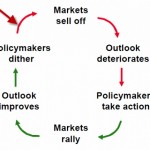
Source: www.zerohedge.com Earlier in the week Zero Hedge showed the above chart and unfortunately there maybe something to it as it appears the outlook may be deteriorating. Whilst policymakers haven’t started to dither in obvious ways at the moment, with the Spanish government announcing increased austerity measures which will only make their economy worse, there …
Mar 28
Bonds…the best protection from risky markets
Source: van Eyk The above chart shows the 12 month correlation of monthly returns between the UBS Composite index (representing Australian Fixed Interest) and the total return of the S&P/ASX All Ordinaries index (Australian shares). As you can see the correlation between both asset classes is extremely variable and the trendline shows that over the last …
Mar 20
Australian Government Bond Yields…approaching normal
Well…not normal yet. The shorter part of the curve suggests the market is expecting another two 25bps cuts by the RBA but with the Euro sovereign crisis well and truly looking much better its highly unlikely there’ll be any cuts soon. Whilst there’s plenty of evidence that shows the Euro sovereign crisis has improved, nothing …
Mar 10
SPIVA…Australian Small Cap managers demonstrate skill
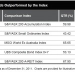
The SPIVA report was released a few days ago and as I’ve mentioend before it is my favourite assessment of the success of fund managers because it takes into consideration survivorship bias…in other words, if you want to know who are the best fund managers over the last year, then you start with all fund …
Feb 20
Excellent long term performance from bonds…but there’s a lot more to it
A look at the average returns of bonds over the last 30 years does not suggest that equity returns have really been worth the risk. Table 1 shows the returns on Australian Bonds (Aust Comm Bank All Series/All Maturities) versus the accumulated return of the Australian sharemarket (S&P/ASX 200 TR) and whilst equities have the better performance …
Feb 10
Don’t forget the E in PE
Source: RBA The above left chart, Forward PE Ratio, shows that the Australian sharemarket is potentially relatively cheap at the moment. The forward PE ratio, which is the ‘current price’ of the Australian sharemarket divided by forward estimates of earnings, has only been lower during the GFC and the 1990-91 recession ‘we had to have’. …
Feb 02
ASX200 to go through 5000!!!
Perhaps haven’t been reading enough but I’ve just read my first article of the year with a fund manager suggesting huge returns for the Australian sharemarket…click here. Apparently the Platypus CIO believes the ASX200 ‘looks set to finish 2012 over the 5000 mark”. At last check the ASX today was 4267 so ifit grows to …
Jan 29
Australian Government Bond Yields…continue slight improvement
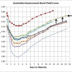
Source: RBA Its been a few weeks since I provided an update on the local government yield curve and consistent with the slight improvement in the sharemarket the Australian Government Bond Yield Curve has indicated a better outlook for the local economy. As the chart shows, since 6 January the yield curve has increased around …
Jan 25
Managing Market Risk using Variable Beta Funds
Lonsec have a reasonable investment strategy paper released today (subscription required) suggesting one of the best ways of managing equity market risk is to use variable beta managers. A variable beta manager is a manager who has the ability to significantly change their exposure to the market depending on their view. So if a variable …


