 Source: Delta Research & Advisory, RBA
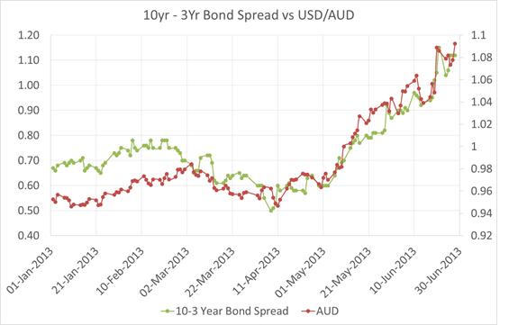
Firstly the red line represents the US dollar/Aussie Dollar (RH Axis), so as the chart shows the US Dollar has strengthened since around the middle of April (so you can ignore the AUD label). The other line is the difference in yield (or spread) between the Australian 10 year Government Bond and 3 Year Government bond and as you can see…in 2013 they are very well correlated.
So what does it mean? Well its often dangerous to associate causation from correlation but I’m prepared to say the Aussie dollar’s decline is a result of a shift out of the Aussie longer term bonds..i.e.a reduction in duration risk back to US dollar cash risk.
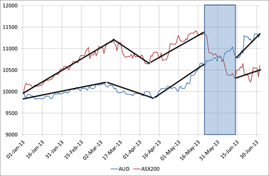
Its not just a reduction of risk in general…whilst the sharemarket has been shaky over the past few months, it doesn’t have anywhere near the correlation and its decline and volatility started in the final week of May, well after the increase in US Dollar and 10yr to 3Yr Spread. As the following hart shows, whilst there has been some correlation between the Australian sharemarket and the strength of the US dollar, there was a breakdown in correlation between Bernanke’s 22 May congress testimony hinting at stopping QE3 and his mid June statement calming markets about it. The following chart pretty much supports that.
Source: Delta Research & Advisory, RBA
So whilst the start of the decline of the Aussie did coincide with the RBA reducing its cash rate, I tend to think a reduction in duration risk (or sell off of longer term bonds) by US investors….which is the opposite strategy you would undertake if you thought rates were going lower (everywhere that is)….is the unusual but contributing reason for the why the Aussie dollar has gone down.


