Source: Mornngstar Direct, Delta Research & Advisory The above chart shows distributions of excess monthly returns over the UBS Bank Bill index from July 2000 to November 2012 for four different indexes that more or less represent the different strategies a bond portfolio can accept… Citi AusBiig 1-3 Yr index … representing short duration Citi …
Category Archive: General Investment
Nov 09
Managed Volatility…the next popular equity strategy
There’s a brief article in today’s Investor Daily News that comments on “Managed Volatility” being the strategy to maximise returns…article here. I have to admit that I believe this strategy will be one of the new trends in equity focused managed funds over the next 12 months or so. Empirical evidence over the years the …
Nov 08
Does Value offer much Value? … this is a discussion on equities performance
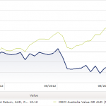
Source: MorningstarDirect The above chart shows the performance of the MSCI Australia Value index versus the MSCI Australia Growth index over the last 12 months (in fact through to close of trading yesterday). There’s obviously a hug divergence in performance as the Value index has returned more than 21% whilst the Growth index has barely …
Sep 18
Australian Government Bond Yield Curve…no change???
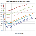
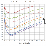
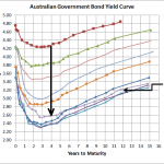
Source: RBA, Delta Research & Advisory Bizaarely as it seems but the above chart shows that over the last month the Australian Government Bond Yield curve has barely budged. There’s really no more than 5 to 10 bps difference across all terms and when you consider the various big announcements, economic results from here, overseas …
Sep 04
Modern Portfolio Theory – Passive versus Active…again!
Not a great deal of posting the last couple of months due to a combination of conferences, flu, and just plain busy so hopefully I can increase the frequency moving forward. A couple of weeks ago I was at a conference and Modern Portfolio Theory was receiving an absolute caning from those on stage. They …
Aug 20
Australian Government Bond Yield Curve…continued improvement
Source: RBA With equity markets improving over the past few weeks, so too have Australian Government Bond yields increased. 10 Year yields were below 3% a couple of months ago and now they are hovering near 3.5%. For Australian bond fund owners that should be a capital loss of close to 2% since mid-June. Nevetheless …
Aug 11
Investment Perspectives
Its been a while since I put some of my broader investment thoughts in writing and I’ve just written almost 4000 words to satisfy that…so it also sort of makes up for my lack of posting. So below is a lot of what I have written and hopefully its readable for anyone interested…I actually haven’t …
Aug 02
Australian Government Bond Yield Curve…slight increase but risks remain
Source:RBA The above chart shows that over the last few weeks there has been an increase of around 10-25bps across the yield curve which is also in line with the marginally stronger equity markets. As I’ve stated numerous times before, the European situation is what is currently driving most major market moves and the partial …
Jul 08
Sovereign Bond Allocation
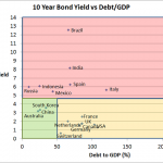
Chart 1 Source: Trading Economics The above chart shows the 10 year bond yield versus the Debt/GDP of the 10 largest countries in the world by GDP (Except Turkey whose bond data is missing). The chart is divided into 3 sections… Red section…countries with high 10 year bond yields Orange section…high debt levels but low …
Jun 27
Australian Equities Style Investing – Value vs Growth
Its been over a week since I posted so I thought I’d write about something that is a little bit different and hopefully may provide a little bit of food for thought. The above chart shows the performance of the MSCI Australia Value index (dominated by low PE stocks) vs MSCI Australia Growth index (dominated …


