May 30
The influence of equities on multi-asset strategies…both less and more than you think
Background
Over recent years many commentators and experts have spoken of the significant risks superannuation funds are carrying with respect exposure to Australian equities. Most notable were comments a few years ago from David Murray, former Chairman of the Future Fund, and Ken Henry, former Federal Treasurer, who both said they had concerns that Australian superannuation funds were overweight Australian equities. Probably the comment I heard the most, coming from many investment professionals, was along the lines of, “balanced funds have around 60% to 70% in equities but this accounted for more than 90% of the portfolio risk”. So I thought I’d finally get around to checking out how true this statement is and if the industry as a whole has changed much over the last few years with respect to the influence of equities and their multi-asset portfolios.
Methodology
If you trust my analysis and aren’t deeply familiar or interested in quantitative methods, then save yourself some sleepy time and skip to the results. Otherwise …
There are two primary analyses undertaken, and both involve regression analysis. Instead of analysing individual diversified strategies, I have chosen the following peer group indices as they pretty much capture the market as best as I can find …
- Morningstar Australia OE Multisector Conservative (0-20% Growth Assets)
- Morningstar Australia OE Multisector Moderate (20%-40% Growth Assets)
- Morningstar Australia OE Multisector Balanced (40%-60% Growth Assets)
- Morningstar Australia OE Multisector Growth (60%-80% Growth Assets)
- Morningstar Australia OE Multisector High Growth (80%-100% Growth Assets)
These indices are also chosen as they pre-tax, thereby, producing an apples and apples comparison with the benchmarks which are also pre-tax.
The following benchmarks represent Australian equities, Global equities, and the risk-free rate …
- MSCI Australia GR AUD
- MSCI World GR AUD
- Bloomberg AusBond Bank 0+Y TR AUD
The following models were used to assess contribution to portfolio risk by equities and the portfolio exposure…
- Rp-Rf = α + β1(Ra-Rf) + ε
- Rp-Rf = α + β1(Ra-Rf) + β2(Rw-Ra) + ε
Model 1 is used to calculate exposure and contribution to total portfolio risk by Australian equities and Model 2 is used to calculate the exposure and total contribution to risk by both Australian equities and global equites.
These regression models are applied to monthly returns between 31/12/1993 and 30/4/2016…which is a long time!
The variables from the models are:
- Rp is the monthly return of peer group index
- Rf is the Risk-free rate
- α is the Alpha of the model (or beta-adjusted excess return)
- β1 is the calculated exposure to Australian equities
- Ra is the monthly return of Australian equities
- β2 is the calculated exposure to the excess return of Global equities minus Australian equities
- Rw is the monthly return of Global equities
- ε is the residual error of the model
The R-squared value of each regression equation is calculated to determine the portfolio risk that can be explained by each model and is therefore used as a proxy for “risk contribution”. The R-squared of a regression model is also known as the “goodness of fit” and its calculation (without going into too much detail) is = “Explained Variation”/”Total Variation”.
Results
Chart 1 – Australian Equity Beta
The above chart shows the Beta, or exposure, of Australian equities to each of the peer group indices. As expected, the higher the allocation to growth assets, the higher the exposure to Australian equities market. Interestingly, since late 2011 it appears the Australian equities beta has declined suggesting a lower exposure. Given the maximum growth assets for each peer groups isn’t much higher than the Australian equities beta for each peer group, you could interpret that Australian equities is the dominant asset class, and maybe it is. But, it may also suggest it is evidence of the relative high correlation between Australian equities and other growth asset classes.
Either way, these results are consistent with expectations and may somewhat support concerns around higher Australian equities allocations given their exposures or sensitivity appears to be a high proportion, but it also proof that this sensitivity to Australian equities has been in decline over the last few years or so.
Chart 2 – Australian Equity Contribution to Portfolio Risk
Now whilst the exposure to Australian equities appears fairly consistent with expectations; its total contribution to portfolio risk is a different story. In essence for the most part over the last 23 years (this chart starts the end of 1996 and is rolling 3 years so really starts in 1993); the Australian sharemarket contributes to a majority of risk across all multi-asset class peer groups and is therefore a very very important part of the portfolio.
Over the last few years, which is the very last point on the far right of the chart, this percentage is in the vicinity of 63% to 83% across each peer group which is somewhat consistent with the concerns spoken of Balanced funds by various experts … that is, “60% allocation to growth assets but responsible for 90% of the risk”. However, even for conservative strategies where the allocation to growth assets is less than 20%, Australian equities contributed at least two-thirds of the total portfolio risk over the last 10 years.
Chart 3 – Australian + Global Equity Contribution to Portfolio Risk
Chart 3 shows the same risk contribution statistic as Chart 2, but this time it is for Model 2, which adds the global equity market. The increase in risk contribution from both equity markets is only marginal because we are adding only the excess return by global equities over Australian equities and the two markets are fairly positively correlated so the impact of the additional asset class is small.
The more interesting results from Chart 3 include, over the last 10 to 15 years Australian Equities and Global Equities account for…
- More than 90% of the total portfolio risk across Balanced, Growth, and High Growth peers of multi-asset class strategies.
- More than 80% of the total portfolio risk for Moderate peers of multi-asset class strategies
- Between 60% and 80% of total portfolio risk for Conservative peers of multi-asset class strategies, despite no more than 20% allocated to growth asset classes!!!
So irrespective of the allocation to equities or the equities market beta, across all risk profiles, equities are clearly the dominant asset class in terms of contribution to total portfolio risk.
So What?
So when “experts” say that “equities account for 90% of total portfolio risk of a balanced fund” therefore implying there is too much exposure, it is not necessarily about too much exposure just the importance of equities. So what should investors do to reduce this reliance on equities? As we see above, only holding 20% maximum of growth assets like the conservative peer group, still produces a very high proportion of portfolio risk due to equities.
The answer is to include non-correlated assets…or in English, add assets to the investment portfolio that behave differently from equities and go up when equities go down. This reverts to Markowitz 101 and is the continued search for the holy grail of investing…including non-correlated assets to the portfolio that can reduce the risk without reducing the return expectation or increase the return without increasing the risk.
The obvious non-correlated asset over many years has been conservative highly rated bonds…which I believe was Ken Henry’s suggestion when looking to reduce the reliance on equities. Adding conservative bonds to a portfolio did reduce the contribution to risk from equities (see Charts 2 and 3 above) but as we know, adding conservative bonds is unlikely to improve the return expectations from equities and by our industry’s definition, obviously changes the risk profile. A good example of reducing equity risk are lifecycle funds. These have a moving risk profile (i.e. decreasing through time) and they gradually increase a fund’s exposure to bonds throughout time. The effect of this is to reduce the size of the volatility to combat sequencing risk leading into and through retirement, but the volatility will still be most dependent on equities.
Other potential lowly correlated considerations are alternatives, like property, private equity, infrastructure, or perhaps hedge fund strategies. There is much debate about the value of some alternatives (asset consultants and fund managers in favour of Alternatives and some big institutions are throwing in the towel, i.e. CALPERS), and if you do believe alternatives are the diversification solution, significant care must be taken to truly understand what is driving the underlying risk of these strategies. Particularly because equity markets may still be a very influential driving factor!!! Either way, if alternatives do reduce the reliance on equities in portfolio risk equation, they do so by introducing other risks … which is not necessarily a bad thing but may be. So the challenge then becomes about assessing whether those risks are adequately compensated.
Final Thoughts
The investor faces very challenging times. Interest rates both here and around the world are so low, that retired millionaires are at significant risk of running out of money. To produce higher returns still requires the acceptance of higher risks but escaping equity market risk is not at all easily achieved without significant sacrifices in costs, liquidity, or chancing the unknown. So no matter what the investor’s investment strategy or risk profile, there will most likely be a strong reliance on equities driving their success. So please note, the communication of this bigger picture concept will always be more important than the marginal advantages gained or lost from manager selection, dynamic asset allocation, security selection or whatever the latest trend is.
Mar 30
Australian Equities Market from a Global Equities Perspective…quant- style
It’s well known that the Australian equity market is only around 2% of Global equity markets. When we have allocations that overweight the Australian equities asset class compared to the Global equities asset class in our portfolios, it is typically justified due to the benefits of franking credits, higher dividends, and perhaps familiarity. The primary risks associated with the Australian equity market are mostly the concentration therefore lack of diversification…it is really dominated by two sectors, financial services (~50%) and materials (~15%).
When choosing strategies or managers for each asset class, portfolio constructors will often look at capturing or avoiding particular systematic risks. For example, we may combine “value” and “growth” styles or perhaps acknowledge particular anomalies and bias a portfolio towards a “value” or “quality” styles across a variety of equity markets, and other systematic risks such as size, momentum, low volatility, or perhaps illiquidity may also be considered, amongst others. However, I think it’s fair to say the impact of systematic risks is rarely considered across asset classes … so I believe there may be a few unanswered questions of which one is … what systematic risks does the Australian equities asset class bring to the global equities asset class?
I’m glad I asked…
Without a deep dive analysis, one might argue that compared to major developed markets, Australia’s high dividend yield, currently lower PE Ratio, and generally smaller companies, one might think the Australian equity market behaves like a global small cap with a value style tilt. Perhaps the high commodities exposure and economic link with China might suggest there’s a growth component and/or behaviour that is emerging markets-like. So what is the truth?
Chart 1
Source: Delta Research & Advisory
Without boring you with too much detail with respect to the analysis leading up to the above chart. I can tell you that Chart 1 shows the risk contribution or risk “make-up” of the Australian equity market based on a number of global equity market risk factors. Namely,
- Global Market Risk (MSCI World GR AUD risk premium to Cash)
- Value (MSCI World Value minus MSCI World Growth)
- Size (MSCI World Small minus MSCI World Large)
- Emerging Markets (MSCI EM minus MSCI World GR)
- US Dollar (US Dollar vs Australia Dollar)
- Idiosyncratic (Everything thing else) … which I assume may be mostly Australian company specific risks
Each point on the chart represents a rolling 3 year contribution to risk of the various factors mentioned above. Whilst numerous studies of managed funds have shown high levels of risk contribution from the market (e.g. more than 90% from the famous Brinson, Hood, Beebower study of US Pension funds), the contribution to the Australian equity market risk from the global equity market has been consistently less than 50% since the start of this analysis in 2001 (don’t forget the rolling 3 years, hence why the chart starts at 2004).
The global Value factor (Purple) barely gets a look-in, but there are strong risk contributions from…
- Size (Red colour – until the 3 years to mid-2014)
- Emerging Markets (Orange), and
- US Dollar (Green – particularly since the 3 years to mid-2007)
Idiosyncratic risks (or those risks that can’t be captured by the others – brown colour) are a very large contributor to total risk and over the last three to four year has contributed between 60% to 80% of total Australian equity market risk. From a portfolio construction perspective, this may be a good thing. Why? Because, these idiosyncratic risks, which are possibly mostly Australian company-specific, are uncorrelated with global equities and the other systematic factors…this means the Australian equities asset class does carry with it a reasonable level of diversification…or at least lack of correlation.
So, having established the contributions to risk, how big are these contributions?
Chart 2 shows the global market beta has averaged around 0.55 over the last 15 years or so, suggesting the Australian market in the context of global equities is a low beta strategy. As shown in Chart 1, this risk factor is not the majority contributor to risk, so there’s a lot more to Australian equities than behaving like a low beta Global equities strategy, but nevertheless it is still significant and having lower relative risk than the global share market may not be a bad thing.
Chart 2
Source: Delta Research & Advisory
Given its low contribution to overall risk, unsurprisingly, the Value risk factor is pretty much zero…it jumps between being “value”-like (above the zero line) and “growth”-like (below the zero line) to average slightly growth-like at -0.08 but it’s not at all statistically significant so can be ignored. The Australian market is neither a value or growth market.
The Size factor, has mostly been positive and strongly so. This suggests the Australian equity market has mostly behaved like a small-cap biased global equities strategy … and considering the average market cap of the Australian market that should also come as no surprise given what we know…let’s face it, Australian companies are nowhere near as big as Apple, Microsoft, etc. In fact, the combined market cap of those 2 companies alone is more than the Australian equity market as a whole.
The Emerging Markets risk factor, which I’ve treated as an extension to the Global Market, is also significantly positive suggesting that Australian equity market performance has a positive correlation with the performance of Emerging Markets. However, with levels consistently around 0.5, the Australian market also has lower Emerging Markets beta so has slightly lower price volatility impact. This is probably due to our close trading relationship with China coming through, but at least it comes with slightly lower risk.
And the final systematic risk, being the US Dollar relationship with the Aussie dollar, is also a very significant factor utility of over 0.5 (and up to 0.8 in recent years) suggesting that on average, when the Australian dollar falls by 10%, it has a performance drag on the Australian market by around 6%. This US Dollar factor might be regarded as an economic factor, as the Australian dollar weakens when the economic outlook weakens, so this result is also not too surprising.
That leaves, the “Pure Alpha” which is the additional return the Australian equities market provides after the above-mentioned systematic factors are removed. Given the significant overweight most portfolios have to Australian equities, it is pleasing to say that since 2001 this higher allocation has produced an average risk-adjusted alpha of a positive 2.9%pa. The alpha hasn’t always been positive, particularly in recovery years following the GFC, but it does suggest the inclusion of Australian equities as an asset class has been a worthy one … and these figures don’t include franking credits which would add even more alpha (say around another ~1.5%pa).
So all-in-all, over the past 15 years the Australian equity market has shown it is driven by some global systematic factors including global equity markets, emerging markets, global small caps, plus some US Dollar influence. The Australian equity market cannot be seen as either value or growth and a large proportion of its performance is probably unique to Australian conditions and hopefully the positive alpha that has been generated over that time can continue.
Feb 07
Some Simplisitic Australian Market Analysis … setting a forecast baseline and a few trend-lines
Like all economies, the Australian economy is always facing significant challenges. Since 1970 there has been the 1973 oil crisis and double digit inflation of the 1970s, the 1980-81 recession, further high inflation of the 1980s, crash of 1987, the recession we had to have in 1991, Asian crisis of 1998, global tech crash from 2000 to 2001, and of course the GFC…and I’m sure I’ve missed a few. Following the GFC, and with fair reason, investors have been told to expect low returns. Interest rates are low, so investors should expect low equity returns too. Of course, we never really know how long this is supposed to last and the wiser financial economists will rarely put a timeframe on these issues …but I digress.
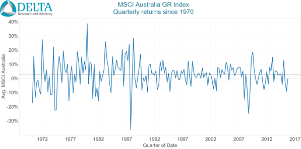
The goal of this article is to set a baseline for Australian equity market return expectations using a long(ish) look at a few key measures. Now, I do realise there are very few believers that past prices can tell you something about the future…but…and you knew that but was coming…there is a somewhat remarkable consistency to the trend of equity market returns over the last 45 years as shown in Chart 1.
Chart 1
Source: MSCI, Delta Research & Advisory
Sure there is a lot of volatility but looking through all of that, since the end of 1969 (and that’s all the data I have), the trend-line through Australian equity returns is flat…that is…it is pretty much same as the average return. Now when it comes to measuring performance, in my opinion and many others, using a trend line is a superior method to simple point-to-point return analysis as it reduces starting and ending point biases. A second observation of Chart 1 and this flat return trend and maybe in spite of this trend, is that equity market volatility appears much higher during the high 1970s and 1980s then afterwards. So we have varying volatilities but a flat trend line of returns.
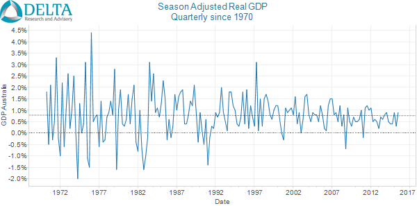
Now one of the numerous factors driving equity market success is the state of the economy. Chart 2 shows GDP (seasonally adjusted) over the same time period, i.e. since the end of 1969, and whilst direct correlations between equity market returns and economic growth may be weak, Chart 2 does suggest two similarities. Firstly, the trend line, like with equity markets, is flat over the 45+ year period, and once again, the 1970s and 1980s are also more volatile than the following period.
Chart 2
Source: ABS, Delta Research & Advisory
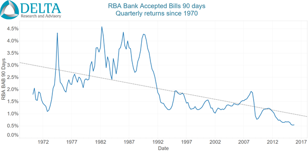
Now whilst GDP and equity market returns have shown flat trends (albeit with volatile volatility), there is one financial market that has changed significantly … interest rates. Chart 3 show quarterly returns of the RBA Bank Bill 90 day index since 1969 and this time there is no sign of a flat trend and little doubt the trend is down … and significantly so…but this should come as no surprise. The high inflation 1970s and 1980s resulted in high interest rates whilst over the last 25 years, has seen the lower inflation provide the Reserve Bank with scope to reduce rates to deal with the ongoing maintenance of economic growth and employment. Corresponding with this, is once again the same volatility pattern…high volatility in the 1970s and 1980s and since then…a significant reduction since.
Now when forecasting long run market returns, valuation is typically a very important factor along with many other metrics (depending on who you ask) and I don’t intend to address those here. As mentioned, the intention of this short piece is to set a baseline for expectations that can be expended and improved.
The above trend analysis suggests a real possibility that average equity market returns may continue to trend sideways …certainly 45 years (as much data as I have) isn’t a bad start. I believe the main question around what equity markets will do starts with the future trend of inflation…which means the Reserve Bank plays a key role as it’s key operating philosophy is that it believe it can contribute to Australian economic prosperity by setting the cash rate to meet an agreed inflation target.
So if inflation stays low, so too will interest rates, and déjà vu, we may continue to see what has more recently been happening. If on the other hand we experience higher inflation, interest rates will increase, which may increase equity market volatility as the denominator of valuations are placed under pressure.
Chart 3
Source: RBA, Delta Research & Advisory
There is, however, one inflationary scenario not captured in the Australian economy and financial markets since 1969 and is rarely talked about; at least in the Australian context…deflation. There is definitely a complacency in the Australian economy which is probably due to the fact it has been so long since Australia actually had a technical recession. Whilst deflation is not a high probability scenario, Australia does face numerous challenges that don’t rule it out altogether. Australia’s economy is transitioning to new economic drivers; the resources investment boom is over; population is ageing; Australia has amongst the highest levels of household debt in the world; and this is accompanied by a residential property market that many argue is in a bubble in the largest markets of Sydney and Melbourne.
A severe bursting of this bubble accompanied by deflation (as seen in Japan, Spain and other burst property bubbles) would mean the above scenarios of sideways trends in equity markets and economic growth do not apply. Interest rates don’t have far to fall before reaching the zero bound and the only market mechanism left would be further weakening of the Australian dollar.
So the simple baseline scenario for long run return expectations to build from is …
- Continued contained inflation = continuation of the long run trend in equity markets and similar volatility to last 25 years + continued low interest rates
- Higher inflation = continuation of long run trend accompanied by much higher volatility then currently used to + much higher interest rates, or
- Deflation = sharp decline in the current trend accompanied by high volatility + hitting the zero interest rate bound
…or something completely unprecedented.
PS…email me if you require further proof of the above trend analysis
Nov 14
Does higher non-market risk produce higher alpha?…and the possible introduction of the Furey Ratio
Background
There’s a widely held belief that to create alpha (i.e. positive returns after adjusting for risk…let’s say market risk), a manager needs to make meaningful bets away from the market. That is, stop being a “benchmark hugger”, concentrate the portfolio with best ideas, and/or move the portfolio holdings away from the benchmark and possibly be more absolute-return oriented. We have all seen numerous strategies that meet these criteria, have generated strong alpha, but is this a reality or it is a belief that is lacking in evidence, save a handful of strategies that just so happen to tell us so. This article seeks to provide some clues to whether accepting greater non-market risk does produce higher alpha.
Non-market risk…and a few technical bits
Firstly, let’s define non-market risk?
Possibly the most frequently used measure is tracking error (which is the standard deviation of the difference between a portfolio’s returns and its benchmark). Whilst tracking error is a good measure of non-market risk, it can be a little misleading in the example of a geared index fund as there is absolute are no bets away from the market due to being an index fund, but the gearing produces a high tracking error. Therefore I believe tracking error creates a potentially inaccurate bias when it comes to comparing non-market risk to alpha generation.
A more recent popular statistic is active share which describes the percentage of holdings that are different to a market benchmark. A portfolio with a high active share suggests a large difference from the benchmark. Because this statistic is a holdings based measure it is quite difficult to measure on a regular basis. Secondly it is also possible to have a portfolio with a high active share but is highly correlated with the market benchmark suggesting that holdings differences do not necessarily translate into performance differences.
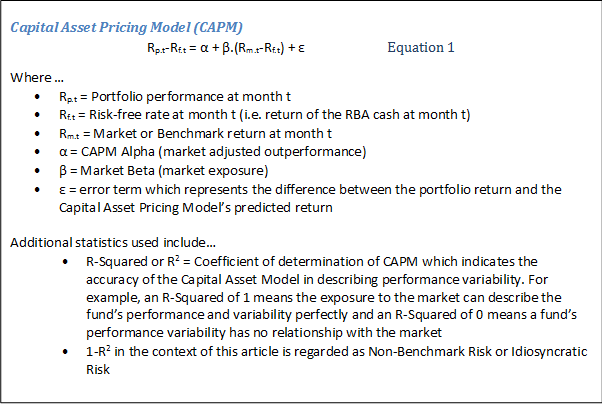
A preferred measure of non-market risk is what some may also call idiosyncratic risk. Idiosyncratic risk is similar to tracking error but is adjusted for exposure to market risk (i.e. market beta) and is defined as the proportion of a total portfolio’s risk due to non-market bets. To be specific, it is (1-R²), where R² is the goodness of fit of the Capital Asset Pricing Model (CAPM) to the portfolio in question … CAPM is represented by Equation 1 below. A second advantage of using idiosyncratic risk is that Equation 1 is also used to calculate Alpha…so a win-win.
So the statistic this paper places most emphasis on is… α/(1-R²)
…and after checking numerous textbooks, I cannot find a name for it, so for this paper will declare it the “Furey Ratio” until someone corrects me. The Furey Ratio is similar to the Information Ratio (which is the ratio of excess benchmark return divided by the portfolio tracking error) but unlike the Information Ratio, the Furey Ratio adjusts for different levels of market risk. So the Furey Ratio is another measure of risk-adjusted return and is Alpha per unit of Idiosyncratic Risk. What we really want to see in an active manager is a high Furey Ratio, meaning they are getting big bang for their non-market risky buck!
Now to the analysis…and a few more technical bits
The analysis plan is to assess whether managers are more likely to produce higher risk-adjusted alpha with greater idiosyncratic risk … so to do this we will test the statistical significance of the Furey ratio, α/(1-R2), from a sample of manager returns.
Data Selection
The manager returns uses performance from two groups of strategies…
- Global Equities (Sample size = 121)
- Australian Equities (Sample size = 226)
…which are the two largest equity asset classes in the Australian investment landscape.
Monthly performance from September 2010 to September 2015 is used and acquired from Morningstar Direct. Duplicated strategies, where the only difference is fee structure, are removed.
The 5 year time-frame to the end of Sep 2015 has been chosen for the following reasons…
- 5 years produces sufficient numbers of both monthly performance (i.e. 60) and number of available strategies
- It is after the Global Financial Crisis period of 2008/09, i.e. from Sep 2010
- It balances the survivorship bias that comes with using a longer time-frame with a reasonable overall sample size…i.e. survivorship bias is a real issue if considering the GFC period as only the better managers survived through to 2015 from before the GFC period
Aside from these reasons, 5 years is still a somewhat arbitrary time period (i.e. it probably makes little difference compared to 5 years and 2 months of data).
Let’s start with Global Equities…
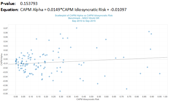
Chart 1 shows CAPM Alpha vs CAPM Idiosyncratic risk over 5 years to end of September 2015 for the 121 Global Equity Managers taken from Morningstar Direct database. All managers chosen have a minimum 5 year track record, and are classified by Morningstar as Global Equities managers.
On the positive side for global equity active managers the regression line in chart 1 slopes upwards suggesting there is a chance that with greater non-benchmark risk comes from higher alpha (CAPM Alpha). This trend demonstrates a positive Furey Ratio but unfortunately, the P-value of 0.153793 of the trend line suggests it is not significantly different from zero at the usual required minimum significance levels (i.e. 0.05)… so weak evidence that higher alpha is not strongly correlated with greater non-benchmark risks.
Chart 1 – CAPM Alpha vs Idiosyncratic Risk – Global Equity Managers (Sep 2010 to Sep 2015)
Source: Delta Research & Advisory
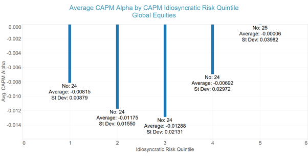
A simple observation from Chart 1 is that there is significant clustering of values at the lower end of the x-axis and a fanning out of alpha levels as Idiosyncratic risk increases. This suggests there may be a reasonable argument that regression analysis of this data may be somewhat inappropriate. So to counteract this issue, the following analysis divides the above CAPM Idiosyncratic risk measure into 5 quintiles.
Chart 2 – CAPM Alpha vs Quintiles of Idiosyncratic Risk – Global Equity Managers (Sep 2010 to Sep 2015)
Source: Delta Research & Advisory
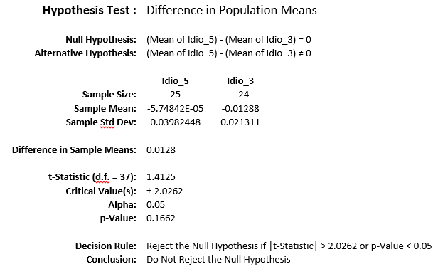
Once again, there are positive signs as there is higher Alpha for the two higher quintiles of Idiosyncratic Risk. However, and unfortunately for active managers, the higher values are not statistically different…please refer the following Hypothesis Test between quintiles 3 and 5 (which have the largest difference).
Source: Delta Research & Advisory
So stopping the analysis of Global Equities strategies there, so far there is little evidence to suggest a statistically significant and positive Furey Ratio amongst the Australian market of Global Equities managers over the last 5 years … therefore suggesting higher idiosyncratic risk probably hasn’t produced higher alpha.
…lets move on to Australian Equities strategies
Similar to Global Equities strategies chosen, a sample of Australian Equity managers have been chosen from the Morningstar Direct database, duplicated strategies have been eliminated, and 5 years of monthly performance between September 2010 and September 2015 used for the following analysis.
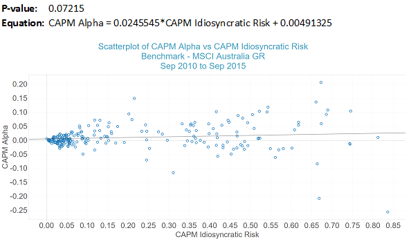
Chart 3 shows that once again there is the spread of Alpha as Idiosyncratic risk increases and the slope of the line (i.e. Furey Ratio) increases. Also similarly, the Furey Ratio is not significantly different from zero at the 5% level (P-value = 0.07215 which is greater than 0.05), also indicating this chart does not suggest greater alpha from higher levels of idiosyncratic risk…at least using statistical tests.
Chart 3 – CAPM Alpha vs Idiosyncratic Risk – Australian Equity Managers (Sep 2010 to Sep 2015)
Source: Delta Research & Advisory
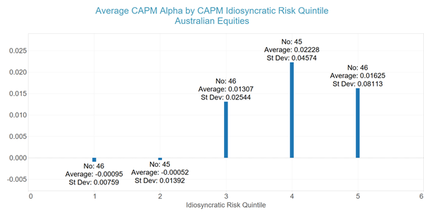
Like Global Equities there is a reasonable argument that the regression analysis is not appropriate due to the larger variance of Alpha as Idiosyncratic risk increases so similar group analysis is applied by dividing Idiosyncratic Risk into quintiles and the results are shown in Chart 4.
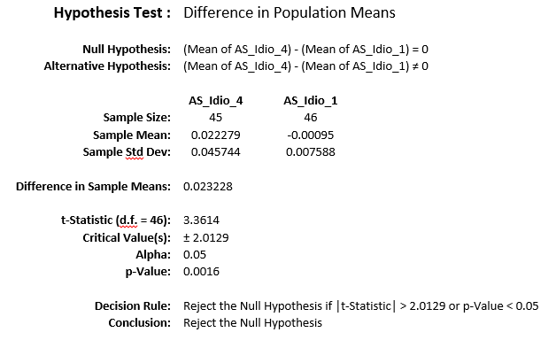
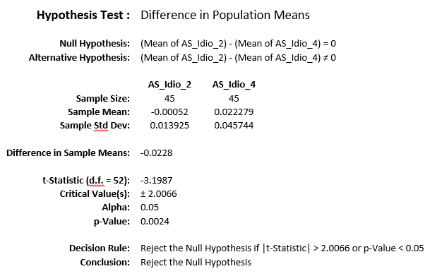
This time there is a statistically significant difference between the Alpha of those managers at the 4th quintile and those at both the first and second quintile…but not between the others (you’ll have to trust me on this)…please refer following Hypothesis Testing results.
Chart 4 – CAPM Alpha vs Quintiles of Idiosyncratic Risk – Australian Equities Managers (Sep 2010 to Sep 2015)
Source: Delta Research & Advisory
Source: Delta Research & Advisory
Source: Delta Research & Advisory
…Stretching the analysis just that little bit further…
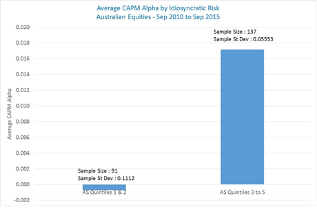
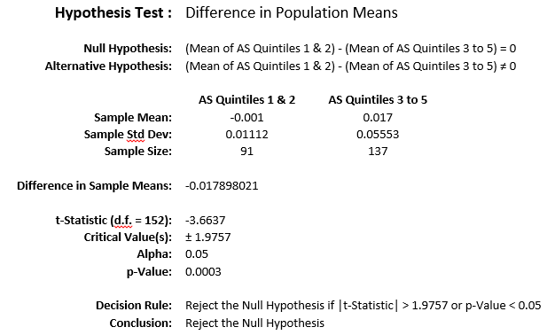
Observing Chart 4, it does appear to show two distinct groups where quintiles 1 and 2 have Alpha results around 0 whilst quintiles 3 to 5 have CAPM Alpha of more than 1% on average…which I’m sure many active managers would be pleased about. Combining the quintiles into these 2 groups yields the following results for CAPM Alpha…
Chart 5 – CAPM Alpha vs Quintiles 1 & 2 and Quintiles 3 to 5 of Idiosyncratic Risk – Australian Equities Managers (Sep 2010 to Sep 2015)
Source: Delta Research & Advisory
…and the difference in means are statistically significant given the Hypothesis rejection below…
Source: Delta Research & Advisory
So, if I may say that after some potential data mining, there may be some evidence that greater idiosyncratic risk relates to higher levels of alpha (or at the risk of being egotistical, a higher Furey Ratio) among Australian equities managers.
For those interested, the level of Idiosyncratic Risk that intercepts between Quintiles 2 and 3 is only 5.82% (which is around the borderline of the clustering in Chart 3)… meaning if the market, as defined by MSCI Australia GR, explains more than 94.18% (i.e. 1 – 0.0582) of an Australian equity manager’s performance volatility, then this may decrease the chances of generating positive alpha and vice versa.
Conclusion
Over the 5 years to September 2015, the evidence within this paper is possibly weaker than many would expect and shows there is little to no relationship between managers generating alpha and idiosyncratic risk…particularly for Global Equities strategies.
There is some evidence that greater idiosyncratic risk has led to higher alpha amongst Australian Equities strategies although it does not appear to be a linear relationship. However, the result over the last 5 years does show that Australian equities managers have, on average, produced a significantly higher alpha if their non-benchmark risk is greater than around 5.8%.
So for Australian equities managers, the optimistic conclusion (so far) is that there are two groups…the first group is the much-maligned benchmark huggers (with idiosyncratic risk less than 5.8%) who have struggled to produce any alpha at all on average; and the second group with idiosyncratic risk that is higher than 5.8% which has produced a significantly higher alpha of 1.7%pa over the 5 years to September 2015. This result doesn’t mean the higher the idiosyncratic risk the higher the alpha (because of the lack of linear relationship) but it is some evidence that a higher non-benchmark risk does increase the chances of positive alpha…so the jury is still out but benchmark huggers should beware.
Nov 07
The importance of asset allocation in Australia…BHB revisited
We’ve all seen various developments in product design from hedge funds to long/short to real return approaches, and then there’s the increased focus on tactical and dynamic asset allocation. You would expect all of this to lead to different drivers of portfolio risk…i.e. away from traditional asset class drivers to market timing, investment selection, and more exotic asset allocations.
So 30 years ago, Brinson, Hood, and Beebower demonstrated that more than 90% of a group of more than 90 US Pension fund portfolio volatility was due to the asset allocation decision…so has this changed or is it any different in Australia? To find out, plus a little more in terms of the importance of active management … click here to download my paper on the importance of asset allocation in Australia.
Alternatively…please click here for the same article at Portfolio Construction Forum
Sep 20
A widely accepted portfolio construction flaw
The typical approach to portfolio construction in the world of financial planning is a 2-step process (of course, this is after the desired risk and return characteristics are settled). The first step is setting asset allocation and the second is investment selection where most of the industry chooses to select from a variety of managed fund strategies.
Whilst there may be many different outcomes across the industry with respect to the asset allocation decision, estimates of return and/or risk for a variety of asset classes are considered before settling on the recommended result … whether it be designed around risk profiles, return objectives, or allocation of risk. Unfortunately it is the second step of portfolio construction. i.e. the investment selection, where a major flaw exists across the industry and the final portfolio may introduce greater risks than realised.
Part of the problem is that the 2 steps are approached in an independent way. Firstly, the asset allocation decision is a market beta decision…that means the allocation is decided according to expectation of the performance of each particular asset class over a particular time period. These performance expectations are based around benchmarks such as S&P/ASX 200, MSCI World for shares, and perhaps Bloomberg Ausbond Composite (formerly UBS Composite) and Barlcays Global Aggregate for bonds, amongst others. So if a particular asset allocation places 30% with Australian shares, then the expectation is that the final portfolio will reflect that 30% allocation.
Where the portfolio construction flaw exists, is that the investment selection may resemble nothing like the asset class it is supposed to represent. For example, within an Equities allocation there may be managers chosen that invest within the Equities asset class but take positions such that the return outcome is completely unrelated to the market the asset allocation decision is based around. Some of these strategies may be variable beta, market neutral, or with specific geographic exposures such as Emerging Markets or as extreme as India or China. Whilst there may be potential return merit in the chosen strategies because the decision is independent to the asset allocation, the investor experience may be very different than expected.
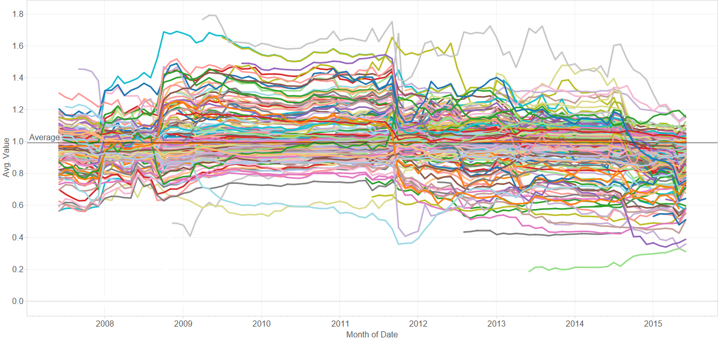
The following chart, whilst intentionally ridiculously messy, shows the 3 year rolling market beta over the last 11 years for more than 250 Australian equities managers…and they are all long only or long biased strategies. What is shows is that whilst the average beta of all strategies is 1 (you may be able to see the average line on the far left or right of the chart) and what a typical investor would expect, the variation in beta, or market exposure, of this strategy investment universe is enormous…it ranges from 0.2 to 1.8.
Market Beta (S&P/ASX 200 TR) exposure of Australian Share funds … each dot point is rolling 3 year average
Source: Delta Research & Advisory
Believe it or not, the fund with the 1.8 beta is not a geared share fund (as would normally be the case) but is in fact a long only sector specific strategy, whilst the strategy with the 0.2 beta is a deep value long only strategy that uses cash when it doesn’t see opportunities. These types of strategies are quite frequently selected as part of an Australian shares asset allocation although their performance history suggests they are either much riskier than the market like a geared share fund (beta = 1.8) or provide very little exposure at all (beta = 0.2). So if a portfolio constructor is looking to choose investments that reflect an asset allocation these extreme strategies are very poor selections.
So what to do? To be true to an asset allocation requires consideration of the likely market beta of a strategy…and strategies with market betas consistently between 0.8 and 1.2 are possibly best as choosing strategies outside of this range increases risks of significant underperformance and heavy reliance on a strategy generating large alpha…and alpha is not always easy to come by. We know that past performance rarely equates to future performance but the same is not the case of a strategy’s beta as a very high proportion of strategies do show consistent betas (which are often mandate determined).
It is expected that many portfolio constructors, particularly the objective-driven believers, will not like or appreciate the “beta 1” approach to strategy selection and in the context of their investment philosophy that is fair enough. As mentioned above, the root cause of this portfolio construction flaw is that the asset allocation decision is independent to the investment selection decision.
So the true solution of this portfolio construction dilemma may be that there is no 2 step process to portfolio construction and the asset allocation and investment decision is performed simultaneously. Earlier in the year there was a widely held belief (and perhaps still true today) that all major asset classes are expensive. If this is the belief then beta of 1 may be a poor investment decision and movements away from market risk and towards smart beta and/or alpha potential is best. Either way, understanding the beta of the investment selection is an important part of the portfolio construction decision and one that will aid in aligning with the true desired portfolio outcomes and beliefs.
Aug 26
Real Return funds…lacking real-ity?
What a fascinating investment world its been over the past few months. We’ve had concerns about Greece exiting the Euro, commodity price crashes, a Chinese sharemarket crash and now some of the biggest developed economy sharemarket declines since the dark days of the GFC. Volatility has been somewhat benign for a long time thanks to QE3 and the money printing out of Japan and Europe but its come back with a vengeance.
One of the more recent trends in the product landscape resulting from the GFC has been objective based investing…most notably Real Return funds. The story goes that investors are looking for a decent return above inflation and don’t really want exposure to the nasty volatility of sharemarkets as this market exposure didn’t appear too aligned with their true investment goals….so these objective-based investments appeared (or at least most of them did) following the GFC and have been quite popular.
Today (and pretty much most of recent times), these products have a bit of a problem…unfortunately these products have dug a hole for themselves and will probably struggle to get out. The problem is they are real return plus “too much”….and it has turned them into investments that not only will struggle to meet their objectives, but have landed their investors back where they came from…that is, exposures that carried too much risk.
The most popular objective (at least that I’ve noticed) of Real Return funds is CPI + 5%. A few years ago, this wasn’t perceived as too big a problem….Cash rates during 2011 and 2012 were in the mid 4%s, term deposits were paying attractive premiums (150bps+) over government bond yields, as too were investment grade bonds (BBB rated bonds were 200-300 bps of government bonds) so with an expected CPI at the RBA target mid-point of 2.5%…scrambling for a few extra basis points didn’t require massive risk taking and a diversified portfolio of defensive and risky investments could do the trick.
Fast forward to today and its a completely different story…
- RBA Cash rates are at 2%…below expected inflation…and priced to go lower
- Government bond yields are yielding between 1.8% (for short term) and 3.2% (if you want 15+ year terms)
- BBB rated bonds have premiums at less than 2% over government bonds with total yields for 3-5 securities at less than 4%
…meaning these traditional defensive securities are quite debilitating to any portfolio looking to achieve CPI + 5%. This can only mean that in order to achieve the desired objective requires loading up on risk and a fair bit of it. Risk from sharemarkets, junk bonds, and almost by default…illiquidity.
None of this should have come as too big a surprise when you consider the last 50 years…equity returns in Australia and Globally have produced real returns of only a little more than 5%…pretty much equaling these Real Return objectives, whilst bonds and cash have understandably fallen well short. So portfolios containing not much other than equities (& other risky assets) should have been expected.
So today, we are clearly in a position where these Real Return funds (or at least those with +5% real targets) require significant levels of risky assets to achieve objectives, and waddayaknow…we have badly behaving sharemarkets. Hopefully this bad behaviour is short-lived but either way, I have to wonder how these objective-focused or real-return investors will react when they discover, once again, their objectives are struggling to be met and/or they are carrying uncomfortable levels of risky assets. Unfortunately the main problem real return investors have failed to grasp is that there aren’t too many asset classes that actually provide real returns of a +5% magnitude…sure they might outperform inflation by 5% over long periods of time, but the returns are typically not highly correlated to inflation so real returns is quite the misnomer. Oh yeah…and inflation linked bonds don’t provide anything like CPI + 5%.
So the bottom line… real return investing isn’t too real at all with big targets like CPI + 5%…it is an objective that is not strongly linked to the reality of investment markets so prepare for another investment approach aligned with disappointment.
Fire away!
Feb 21
A few simple thoughts on a few not so simple markets
Following are my recent thoughts around markets with many charts to support these views. These views are far from complete but do represent a reasonable summary at this point in time.
Income Assets
Source: RBA, Delta Research & Advisory
- The above left chart suggests the market believes the cash rate is heading towards 1.5% to 1.75% and there is likely to be continued weakening of the Australian economy
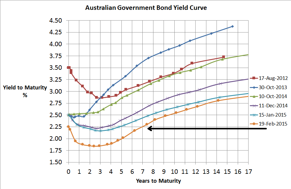
- With cash rates currently at 2.25%, cash does appear to be slightly better value than conservative bonds where the yield is less than 2% around 4 to 5 year terms.
Source: RBA
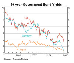
- Major global bond yields continue to trade near record lows with little sign of inflation or rising interest rates anywhere
- Despite that, there is talk of an increasing cash rate in the US and too much too soon is likely to put significant strain on the US economy and therefore equity market also.
Source: RBA
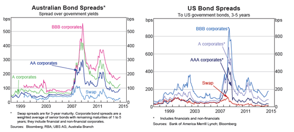
- With BBB spreads only around 180 basis points above government bonds, then the expected return of the Australian Fixed interest market (~UBS Composite) over the next 3 to 5 years is only around 3%pa.
- These spreads do represent slight value as traditional default rates are below these spreads suggesting a higher risk-adjusted return can be had if Australian credit is held for the long term
- US Credit spreads appear to be at similar values to Australian credit also suggesting similar value.
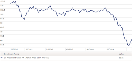
- However, a significant number of high yield corporates are energy companies and the collapse in oil prices (see below) do make the high yield sector somewhat riskier than usual
Source: Morningstar Direct
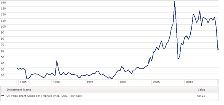
- Oil’s recent price collapse is the second biggest over the last 30 years
Source: Morningstar Direct
- Prefer Cash over Australian Bonds over Global Bonds but investment grade credit also has marginal appeal.
- So overall preferred strategy is short duration, investment grade credit
Equities
- As suggested above, Australian and major global economies continue to appear weak or fragile at best.
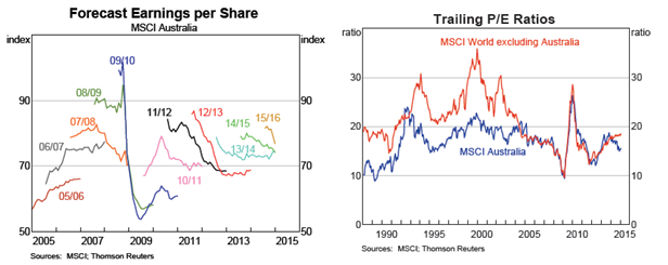
- Forecast earning for Australian companies for 2015 and 2016 years have been in decline
- Despite economic weakness everywhere, Australian sharemarket appears to be significantly better priced than global shares on a PE ratio basis by the biggest margin for over 10-12 years
Source: RBA
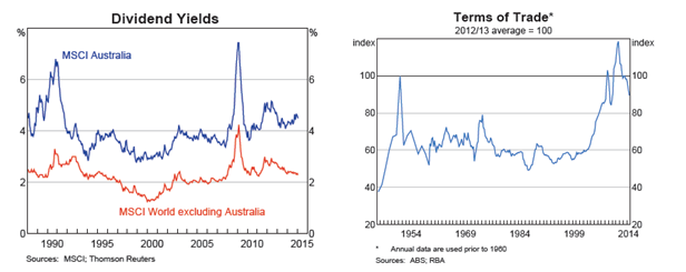
- Supporting the lower valuation is also a superior dividend yield from Australian companies and when you add the “only available in Australia” franking credits, the simple view suggests much better value for Australian equities
Source: RBA
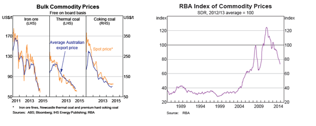
- However the key risk to the Australian market is the rapidly declining terms of trade lead by the decline of key export commodity prices which will flow into most aspects of the Australian economy.
Source: RBA
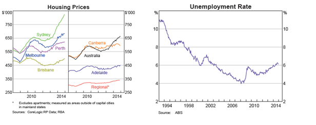
- Other threats to the Australian market include a collapse in residential house prices which are at record highs in most cities, although are at threat should unemployment spike higher
Source: RBA
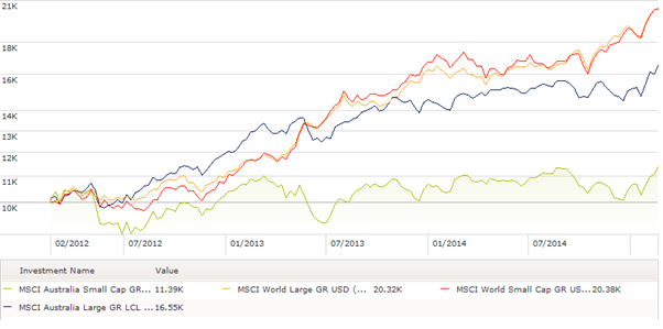
- Whilst Australian equities appear better value than global equities, Emerging Markets appear even better again with a PE Ratio significantly below global equities (13.4 vs 17.9). Other valuation metrics for Emerging Markets are also quite favourable including forward PE ratios, and price to book value.
Source: www.msci.com
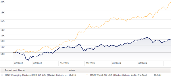
- Emerging Markets equities have also performed quite poorly in recent years thanks to the slowdown in China which, like Australia, has been a dominant economic force.
- The risks for investing in Emerging markets is the instability of their currencies which have been incredibly volatile over the last couple of years (since there was an original hint of the unwinding ofQE3).
Source: Morningstar Direct
Property & Infrastructure
Sources: www.spdr.com.au , www.ftse.com
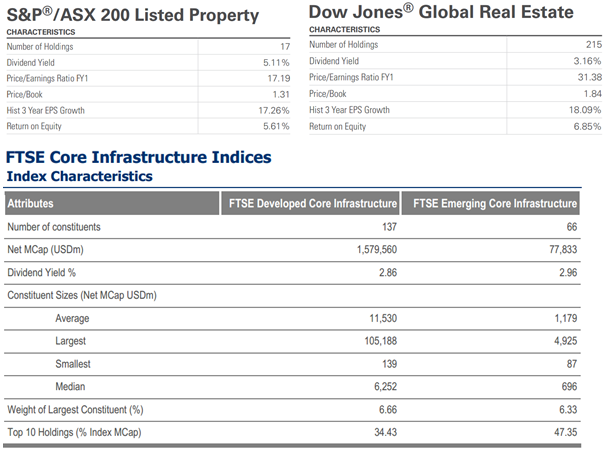
- Australian property paying higher dividend yield by around 2% which is also around the carry received from hedging global property into Australian dollars
- Price to Book value and forward PE suggests Australian property may be better value although return on equity has been lower which is most likely a reflection of the lower gearing levels in Australia
- Greater diversification or less concentration in the Global Property market compared to the Australian market which is dominated by a few securities such as Westfield
- The table below shows a current dividend yield of only 2.9% for developed infrastructure which is slightly lower than global property and a reflection of its recent strong performance
- Value in all three sub-asset classes has diminished significantly
- Current trend of chase for yield may assist these asset classes in a low interest rate environment but their value appears weak
Equity Styles
Value vs Growth
Source: Morningstar Direct
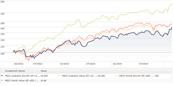
- Significantly stronger performance by Australian value over Australian growth during last 3 years…belief in mean reversion suggests a bias towards growth strategies
- Very little difference between value and growth among global equities so preference remains value
Small vs Large
Source: Morningstar Direct
- Similarly Australian smaller companies have significantly underperformed larger companies
- Very little difference between large and small among global equities so given the high valuations a preference is to keep the typically more volatile small companies to a minimum
Nov 13
Industry Super Funds, Transparency…and stretching the truth a little
One of the bigger frustrations for advisers is the lack of transparency of industry super funds. Advisers and researchers do not have deep access to their investment processes, often with little understanding as to what comprises an investment strategy beyond anything other than the asset allocation. As a result, in general advisers don’t recommend industry super funds as they struggle to satisfy the “know your product” part of their recommendations…there are exceptions and other reasons for recommending them, perhaps administrative efficiency, but advisers typically have concerns around the lack of transparency of investment risks.
Now not all Industry Super funds are completely lacking in transparency. For example Rest Super provide good detail of their long term historic performance as well as a list of investment managers that underlie each investment strategy/asset class…fantastic. This means for Rest Super we may be able to get some understanding of what risks may exist…a step in the right direction.
One of the prevalent asset class definitions among Industry Super funds is “Defensive Alternatives”…personally, I tend to think this term is an oxymoron. There is little doubt that alternative strategies can and do provide diversification benefits to a portfolio with the ability of increasing return potential whilst lowering portfolio risk. But on their own, I believe their alternative risks can rarely be relied on when you need them most…particularly when most alternatives are defined as Hedge funds, Private Equity, Commodities, or perhaps Property & Infrastructure.
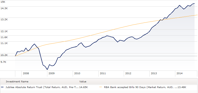
One of the strategies that is disclosed as part of Rest Super’s “Defensive Alternatives” is Jubilee Absolute Return Trust. Now its possible that Rest have a special mandate with Jubilee such that this investment is defensive, but when you consider the following performance chart of Jubilee versus cash and the near 20% drawdown towards the end of 2008, I’m pretty confident many would have a big question mark of its defensive status…certainly it wasn’t negatively correlated with risky assets during the worst of the GFC…and isn’t negatively correlation to risky assets what you want from a defensive investment???
Source: Morningstar Direct
Anyway, the key message is that you should never believe what an investment manager says and one person or firm’s definition of defensive may differ to someone else’s. The “Know your Product” requirement is an essential one for good financial advice and significant care must always be taken when providing advice on asset allocation alone. Of course, none of this means that the strategy won’t work moving forward…its just investing requires an understanding of risks and whether they are worth accepting.
For Rest Super, the “Defensive Alternatives” asset class as expected is not regarded as a growth asset class so their default Core strategy is self-classified as having 75% of growth asset instead of 84% if you include the 9% allocation of Defensive Alternatives…I’m sure most would agree 75% is quite aggressive, but 84% is a step up again…so Buyer Beware.
My personal hope is that one day, Industry Super funds will move to the levels of transparency that many of the larger retail managers have provided over the year. There is little doubt Industry Super funds do have high quality investment strategies worthy of recommendation by financial planners, but it is difficult to do so whilst there are doubts about “knowing the product”.


