May 05

Revisiting Asset Weighted Returns and the Lifecycle Fund

Given the start of MySuper this year, superannuation trustees have released numerous lifecycle funds to satisfy this new legislation. Whilst lifecycle funds have been popular among superannuation trustees, the investment and adviser community haven’t been so complimentary. Either way, lifecycle funds definitely have a place in the investment landscape and they provide an approach to investment that is cognisant of a very simple concept that is often overlooked by some superannuation trustees’ choice of default fund…asset weighted returns.

So for the purpose of my new readers I have reproduced some analysis previously posted in this blog …the slightly more flawed analysis and similar article can be found here otherwise please read on…

…After thinking about asset-weighted returns and how to apply this thinking throughout the working life of a superannuation member, I did the following little exercise. I know this has probably been done to death by the lifecycle investment gurus out there but I thought I’d see for myself what I would come up with…its not perfect but more than adequate.

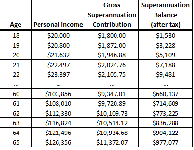
We start with an 18 year old with no superannuation, earning $20,000pa. Obviously 9% must be contributed to super under Australian law (back in 2011), and we also assume his/her income would grow at 4%pa which is roughly in line with average growth rates in AWOTE (Average Weekly Ordinary Times Earnings…I think). Another assumption is that the superannuation investment would grow at an annual rate of 7%pa after tax, which is obviously well above the risk free rate but over a working life of more than 40 years I’d like to think is achievable for a ‘balanced’ investment across multiple asset classes.

A summary of these simplistic results are in table 1 below…

Table 1

Super Balance Growth

Source: Delta Research & Advisory

Now, obviously in the real world, one’s income and superannuation contributions will fluctuate, and of course investment returns will also fluctuate (don’t I know it!!). But, overall the outcomes from Table 1 don’t look too unreasonable.

Step 2 in this exercise is to consider ‘Value at Risk’ or VaR. Whilst VaR is a concept that has been blasted in recent years thanks to its mis-applicaton leading up to the GFC, its still not a bad way of looking at downside risk.

Using various risk and return assumptions, across generic portfolios ranging from 0% risky assets to 100% risky assets, we calculate VaR for each portfolio…the definition is that the portfolio has a 1 in 40 chance of returning lower than the VaR result. For example, we assume for a 70% risky asset portfolio it has a 1 in 40 chance of achieving a return worse than -10.5% in any one year and for a 30% risky portfolio a 1 in 40 chance of returning worse than -3.8%…you may think this is a little optimistic but sobeit, its probably not too far off.

Using this information and using the outcomes from Table 1 for each year from age 18 to 65, we do not wish to have more than $30,000 at risk (that is a 1 in 40 chance of losing more than $30,000 of superannuation). This is an arbitrary amount that could be anything but for the purposes of this exercise I have randomly chosen $30,000.

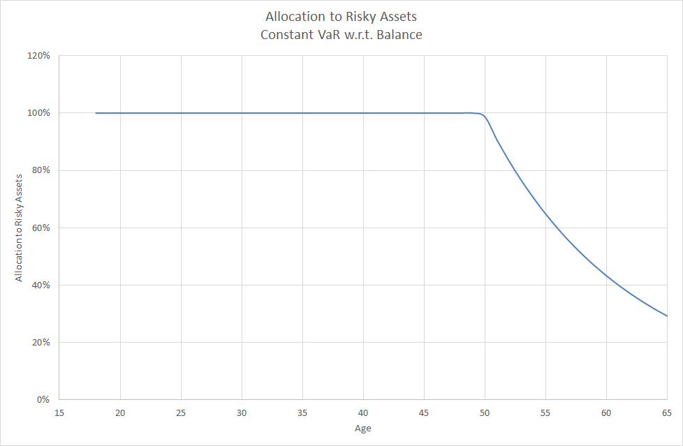
Now for the quant geeks reading this I know there should be some optimisation techniques with regards to the inputs but in keeping things simple we use the balance figures from Table 1. Using the calculated VaR results for each portfolio, Chart 1 shows what the maximum exposure to risky assets needs to be throughout my example’s working life.

Chart 1

GlidePath - Lifecycle Experiment

Source: Delta Research & Advisory


As can be seen, this chart has a very similar glide path that many of the lifecycle funds have. Maximum exposure to risky assets does not start to decline until around age 50 and at age 65 the maximum exposure to risky assets is around 30%.

These outcomes can easily be adjusted on an individual basis depending on risk/return expectations, super contributions, as well as how much super balance one wants to put at risk over time. But these results use my rough estimates.

Now we all experience asset weighted returns…i.e. it hurts more when we lose more money…so…bottom line…if we consider asset-weighted returns and minimising downside dollar specific risk as we move towards the latter part of one’s working life, when designing asset allocation for a superannuation member the evidence supports a lifecycle/glidepath approach to investing superannuation.

Despite this result, there is nothing necessarily wrong with the “balanced” fund as it may well have the best return per unit risk over long periods of time. However, it is an approach that only considers return per unit risk and ignores the size of the underlying balance. The Srategic Asset Allocaiton approach is largely based on a time-weighted approach to investing versus the asset-weighted approach that is the lifecycle or glidepath approach. Both are valid but they depend upon the desired investment objectives which are clearly different.

One final point about MySuper funds (which are funds designed for cohorts) that many overlook….they are almost guaranteed to be inappropriate for the individual investor who is highly likely to have completely different investment objectives…and this is particularly the case for the lifecycle fund just as it may be for the “balanced” fund.


   Send article as PDF   

Apr 24

Absolute return investing…a nice goal but disappointment is likely

Absolute return investing, according to many definitions, is about getting positive returns irrespective of the overlying “market” return of whatever asset class the investor is being exposed to. This essentially means that any “absolute” returning investment needs to employ strategies that are independent of market direction. For example, if the market (and it can be any market) is declining in value, the absolute return investment will need to have long exposures that still may move up (and they may include put options), or perhaps be trading in the direction of the down market by short selling that market…whether at a security level or market level (e.g. futures, CFDs, ETFs, or options).

OK…so that said, absolute return strategies must demonstrate skill in market timing…so they can profit in up and down markets. Much more easily said than done.

Like these first two paragraphs most discussion on absolute return investing just  focuses on achieving a positive return….but there is no mention of how much and what timeframe. Let’s face it, achieving a positive return is very very easy…just place your funds in a bank deposit, choose your term and voila…you have a government guaranteed “absolute return” for your chosen term!

So, what defines an absolute return fund in terms of required size of return and desirable timeframe? My personal belief based on discussions with advisers and investors suggests the required return is “equity-like” and the measured timeframe is 1 year…so each year, investors expect and want to see a positive return that is in the ballpark of cash plus 3 to 4% or perhaps a minimum of 10%pa. So today that means an annual return of around 7% to 10% each year…again much more easily said than done and I would suggest that the risk required to achieve this return goal is quite significant.

So I thought I’d have a look at hedge funds available in Australia (and reported to Morningstar) to see how they’ve actually performed in recent years. I thought I’d give them a helping hand by only looking at the last 5 years (i.e. very close to the bottom of the sharemarket) and there were only 51 strategies that had a 5 year track record…surely there’d be more but no. I chose hedge funds specifically because all other investment categories are “long only” meaning they can’t employ the above-mentioned strategies to profit in down markets.

Of those 51 hedge fund strategies, only 19 did not have a negative return over any 12 month rolling period in the last 5 years…to be honest I thought it would be lower so not a bad result. Of those 19, only 3 failed to have an average return above 7%pa…

…So my positively biased analysis has yielded 16 different hedge funds available in Australia that may meet the investor and adviser’s definition of an absolute return fund…and that’s out of many many more than 3,000 funds available in Australia…as a side note, I also wonder how they’ll go when Global Government Stimulus is no longer the norm and interest rates are much higher?…but I digress.

When you consider that a very high proportion of investors (& advisers) have an “absolute return” investment objective you have to wonder why there are so few investments that are designed to achieve it. The bottom line is that absolute return investing is incredibly difficult and achieved by very few. My personal thoughts and conclusion to absolute return investing…it’s fine to have positive returns year-in year-out as an objective or goal, but absolute returns should never be presented as an expectation as disappointment is inevitable. When aiming for “equity like” returns be prepared for the occasional negative year or two or three.

   Send article as PDF   

Mar 25

Mortgage Funds…still on the nose to me…but perhaps for different reasons than others

Over the last 12 months I’ve increasingly had inquiries about investing in mortgage funds. During the GFC, pretty much all liquid mortgage funds froze their investor’s funds so access was only available in periodic dribs and drabs and for many this process is still playing out. However, there are some new funds which have raised capital in the last few years, are currently liquid, and with the GFC largely behind us, some investors and advisers are getting curious again.

Whilst I absolutely acknowledge that every investment should be considered in terms of its future return potential (not its past), there is one grating problem mortgage funds have that has bothered me for as long as I can recall…and will always be a sticking point…their pricing.

As fixed income securities, mortgages are very complex. Credit risk is difficult to truly understand because investors don’t have any information on the borrowers; Duration risk is incredibly difficult to work out because loans may have the ability to prepay…so when your variable interest rate goes up, you may think hooray, only to see the principal and interest repaid early for you to miss out on that exposure you thought you had.

Let’s not also forget that mortgages are held over property and there may be other mortgage conditions such as minimum LVR requirements, or other financial conditions…these are risks we don’t really see as investors but surely they are conditions that should result in mortgage prices that will go up and down as these risks become lower or greater.

It is clearly these complexities that make a book of mortgages so difficult to price, so mortgage providers just stick with a $1 unit price and simply pay out the interest. It appears the only time a unit price moves is when there is a default…but even then, I have to admit I’m not so sure…as there appears to be very very few defaults or perhaps the defaults simply impact the income payable.

I could show you the price of numerous large mortgage funds over the last few years, but a flat line priced at $1 doesn’t make for a particularly interesting chart so I have chosen not to expose any names.

Anyway, this complete lack of pricing ability by mortgage product providers is why I will continue to avoid mortgage funds.

In my humble opinion, transparency is a very important investment characteristic and its clearly lacking in these products…but there also appears to be no solution.

   Send article as PDF   

Feb 25

Investment Fees…room to trim (wonkish)

When a financial adviser gains a investment client, on an ongoing basis that client pays fees for 3 main services/providers…

  1. Financial Adviser
  2. Investment Management…typically a fund manager
  3. Platform…for investment administration and reporting

There can always be a fair amount of debate as to what the true margins are, particularly given some of the vertically integrated companies might be a little creative in some transfer pricing between the above businesses. However, with IOOF Holding releasing their half yearly results today I thought I’d take a peak at their margins for each of these businesses to see how they stack up.

IOOF’s financial advice businesses include such brands as Bridges, Ord Minnett, and a few more; their investment management brands include their Multimix diversified funds as well as Perennial…both active managers; whilst they have numerous platforms businesses that include IOOF Pursuit, Lifetrack and more. Each of these businesses are substantial and relatively mature so their margins should be a reasonable indicator for their respective sub-industries…

…So what are the margins for each of these substantial businesses?

  1. Financial Advice – 0.23%
  2. Investment Management – 0.26%
  3. Platforms – 0.69%

Whilst I’m sure my logic here is not exact, I’m also sure that many in the industry will not be surprised to see platforms having the biggest margin of all.

In this current environment of continued regulatory change, increased fee transparency, and clients and advisers looking to save wherever they can, there’s no doubt many platforms have reduced their fees but there’s also little doubt that there is some way to go. These large margins are why there are so many platforms in the market…despite the rhetoric, they can survive on relatively low FUM.

BUT…lets not forget those high fee charging managers who have a LOT of room to move…and there are two that always spring to my mind. Firstly because they charge the highest fees and secondly because they are very popular (of course…good performance too). They are Platinum and Magellan!

Every adviser’s favourite long/short global equities manager, Platinum Funds Management recently released their half yearly report…and for the half year Platinum’s investment management revenue was a respectable ~$130million (excluding performance fees and admin fees)…however their total expenses over the same period was just over $21million…resulting in a profit margin that to me borders on way way too much..i.e. 84% (and don’t forget I excluded performance fees).

Every adviser’s more recent favourite global equity manager, Magellan, isn’t too much different. Like Platinum, they charge the big fees and now they’re reaping the rewards…management fees of $59million and $18.3million of total expenses resulting in a profit margin of 69% (excluding performance fees).

Of course, everyone is happy to pay the big fees if the returns they deliver are big also…and there is no problem there (although both Platinum’s and Magellan’s flagship global equities fund unperformed their benchmark over the past year (to 31 Jan) but when you still return 39%…whoopy do!). Either way, lets hope these massive profit  margins that are highly unlikely to go away soon, don’t change the focus of the portfolio managers from managing our client’s money to spending their massive wealth. If they don’t perform…there’s not necessarily any need to withdraw your money…but definitely ask for some lower fees!

   Send article as PDF   

Jan 14

Cliff’s Top 10 Peeves…and a couple of my own

I know this is possibly a little old now but one of my recent favourite articles is about to be published in the Financial Analysts Journal, My Top 10 Peeves, by Cliff Asness of AQR. Just click the article name to open and read for yourself.

There are quite a few gems in there but I have to admit my favourite peeve of Cliff’s are some of the things that people say, like…

  • “Its a stockpicker’s market”, and
  • “There’s a lot of cash on the sidelines”

…I have to admit they drive me nuts too.

This article got me thinking about what my biggest peeve is, and I have to admit it is widely held belief that stockpickers/share managers should be able to produce positive returns and that they should be judged (or benchmarked) based on cash returns instead of broad sharemarket benchmarks such as the S&P/ASX200 or All Ords. I’m afraid if you are a long only share fund manager and your mandate is such that you are only to invest in the sharemarket (and cash), then your benchmark should be based on the sharemarket and your returns will fluctuate just like the market. The broader market (or market beta) is more than likely to be most responsible for your returns, both good and bad, and your market timing and stock selection will hardly result in consistent positive returns no matter how good you are.

That then leads me onto Market Neutral funds and they should be benchmarked to Cash…but my next peeve are from those that imply it is easy to add value by simply investing in cheap shares and shorting overvalued shares such that this outperformance can be easily added to the cash return for a easily gained cash plus return…its not easy and never will be.

   Send article as PDF   

Jan 13

Longer duration looking less risky…relatively speaking

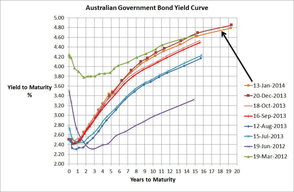
Aust Government Bond Yield Curve - 13 Jan 2014Source: RBA & Delta Research & Advisory

Its definitely been a long time since I posted anything and hopefully this post will at least be a little interesting…I haven’t read a great deal of anything financial over the past few weeks so I apologise if this is old news….but I digress!!

Now, the above chart is the usual Australian Government Bond Yield curve that I always post…why? because it normally says a lot about what’s going on in the world and particularly Australia. In the short terms, i.e. out to 2 Years, it suggests thta the Reserve Bank is more than likely going to keep rates low…that makes a lot of sense whilst the economy is transitioning from a Resources investment boom creating a lot of growth to a relatively unknown economic growth driver. The Reserve Bank definitely want the Australian dollar to be much lower (~85 US cents) but there are other economists believe that it really should be 80cents or lower again.

Beyond that, this curve has steepened and today is very steep…and I really do mean very steep…this typically means that the long run economic expectations are pretty strong. I’m not 100% sure why as locally there are many uncertainties but it is true the global economy is looking much stronger than it has in many years or put another way…the major developed economies are not looking like blowing up…so that should help Australia (although I do believe we are a very complacent nation after 22 or 23 years of economic growth).

OK…how steep is the yield curve?

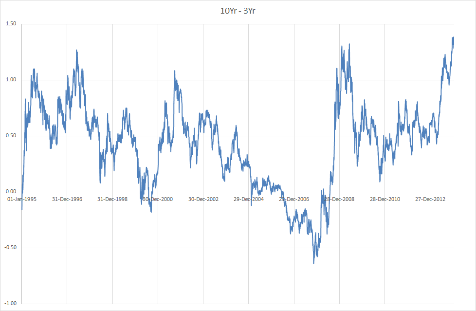
10Yr - 3Yr Aust Gov Bonds

Source: Delta Research & Advisory

The above chart shows that the difference between the 10 year and the 3 year Australian government bond yields is the highest it has been since the start of 1995 (I haven’t looked for data before then as I’m guessing this is sufficient to make my point). So given this statistical rarity, there’s a very strong chance this relationship is unlikely to hold so the expectation of 3 year bonds to increase more than 10 year bonds is reasonably likely over the next 12 months or so.

That doesn’t necessarily make the investment strategy simple because if 3 year bond yields increase and the 10 year bond yield stays the same your bond fund may still have poor returns. However, if the reverse occurs, whereby the 10 year bond yield decreases and the 3 year bond yield stays the same then the returns will be pretty reasonable. Either way, simplistically I do believe a longer duration portfolio is not such a bad thing at the moment…even better if you believe duration may be a reasonable hedge to a falling sharemarket…perhaps the better strategy for the bond manager today may be to short 3 year bonds to buy 10 year bonds. 


   Send article as PDF   

Nov 25

How the economic machine works…by Ray Dalio


Source: www.economicprinciples.org

The above video (hopefully its working) is easily the best description I’ve seen on how economies operate and an absolutely must see for anyone interested.

In the context of the Australian economy it certainly does sound a few bells…perhaps alarm bells…particularly when you consider that the Australian economy has not experienced particularly good productivity growth over the last 10 years, has been deleveraging somewhat (e.g. double digit household savings ratios) over the past few years, has had record level income growth (best in the developed world), and now faces an uncertain future as the resources investment boom is finished and unemployment is expected to climb as the unwinding begins

The requirement for Australia is a lower exchange rate, increased productivity growth, and a government with a long term vision and credible plan for a weaker Australia…oh well, looks like we’ll be in for tough time over the next few years economically. Either way, there is still a bit of fuel in the policy fuel tanks but I’m still backing volatile markets and not the complacent bull markets Australians have almost come to expect over the past few decades.

   Send article as PDF   

Nov 05

MQ Equities Quant Melbourne Cup Pick…

Every year the quants at Macquarie Equities Research produce a research note on who they believe will win the Melbourne Cup. Like any good quant research they use a range of signals and I love the fact they use some well known investment risk factors like value, momentum, and quality.

Anyway, their record is quite reasonable and if you are interested in reading it you can download it by clicking here.

Oh yeah…their pick this year is Sea Moon…but its an unconvincing selection as they a few other ponies very highly too.

   Send article as PDF   

Oct 21

Australian Government Bond Yields…little change in a month but…

Aust Government Bond Yield Curve - 18 Oct 2013


Source: RBA & Delta Research & Advisory

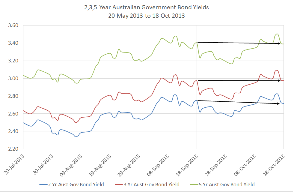
The above chart shows very little change in Australian Government Bond yields over the last month which given what’s been happening in the US seems a little surprising. We’ve had massive fund managers losing confidence in the US Government and selling out of Treasury bonds and there was an 11th hour agreement to stop the US defaulting and sending the world’s financial markets and economies into a potential tailspin. Whilst it didn’t happen, the doubt created is real and there could be repeat in just a few months time so you would have expected a greater change in government yields particularly as they are typically a very good economic predictor…whether it be future inflation or economic growth in Australia.

However, the following chart does show what really happened over the last month…and it turned out there was some volatility in yields…peak to trough within the last month was around a 35bps movement which is quite a reasonable movement. So the change in the yield curve above is clearly not a strong reflection of the recent uncertainty but it does tell another story…

Changes in Aust Gov Bond Yields - 18 Oct 2013

Source: RBA & Delta Research & Advisory

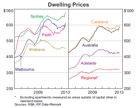
…that is….the fact that the 1 year yields are above the cash rate for the first time in a while…in fact I believe it was around the middle of 2011 before the Euro crisis changed that. Now with a normal-ish looking yield curve (i.e upward sloping), it suggests that the cash rate may be stable to rising over the next 12 months (not necessarily up because there should be a “term” premium for holding the bond for 1 year or more). However, with the Australian dollar at an uncomfortably high 96 US cents at the time of writing, the RBA may struggle with doing nothing to the cash rate and particularly given their expectations are for continued below trend economic growth due to the end of the Resources Investment Boom. On the flipside to the lower argument is the fact that the current cash rate of 2.5% does have downside limits (obviously can’t go blow zero) so going lower without a crisis may unnecessarily use up too much of the RBA arsenal which may be needed given the potential for an overseas-led crisis (could be Euro, China slump, or US debt ceiling crisis Part3) plus there’s the fact we have super high housing costs in Sydney, Perth, and Melbourne (I honestly don’t know how so many people can afford to live there) that may be further fueled by low rates. Whilst lack of supply may be a contributing factor, as an interstater, “value” in housing does appear to be thinly disguised so bubble or no bubble, high house prices could create another problem for the RBA. Either way, there are numerous arguments for both sides of the rates equation.

One thing’s for sure, the recent US debt ceiling debate will ensure there’ll be no tapering of the QE3 so sharemarkets may continue to be artificially boosted and the yield curve suggests that locally there’ll be low interest rates, low inflation, and low economic growth for some time yet.

Housing Prices

Source: RBA


   Send article as PDF   

Sep 23

RimSec September Research Report

This was written last week so is only a couple of days old so here is the RimSec monthly research report for those who are interested. Click here to download.

There is the usual commentary on interest rates, the economy, and market expectations. The final article is a small piece on what is happening and what could happen in the high inflation emerging market economies where currencies have been depreciating whilst inflation is still high…ouch!

   Send article as PDF   

Older posts «

» Newer posts

Follow

Get every new post on this blog delivered to your Inbox.

Join other followers: